Independent 2 week journey project to explore different concepts, this was my chosen concept to explore further in the next module: Destinations.
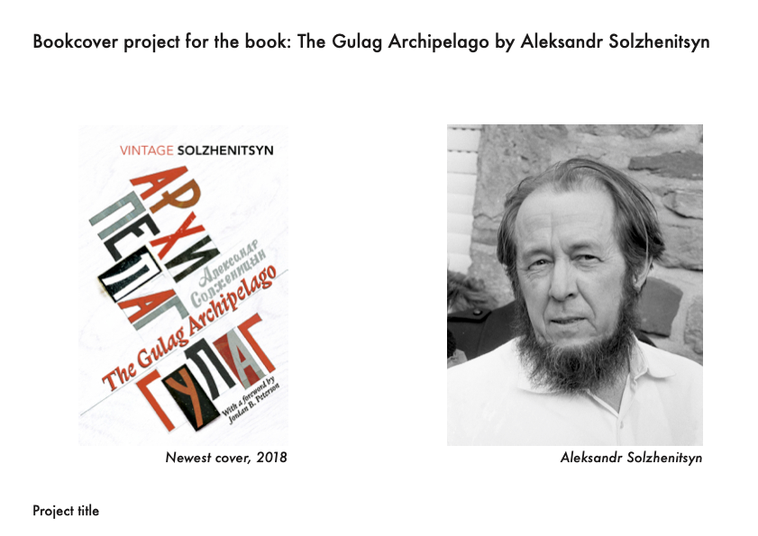
For my module in my final year we had the freedom to do what we wanted, and I wanted to create a bookcover design for a book I was reading at the time,' The Gulag Archipelago’ by Aleksandr Solzhenitsyn I thought this would be a good opportunity to do this for one of my projects redesigning the cover of the book as I wanted a chance to use screen-printing to create this as I felt that I lacked physical creation in my portfolio.
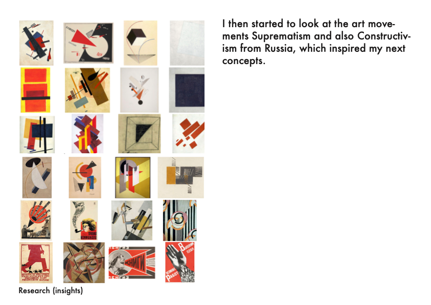
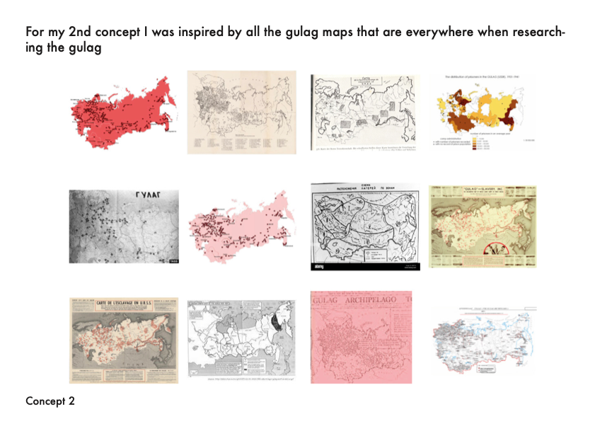
I believe that from my research that this book was missing a new design, but one that still respects and is inspired from art movements from the Soviet Union.
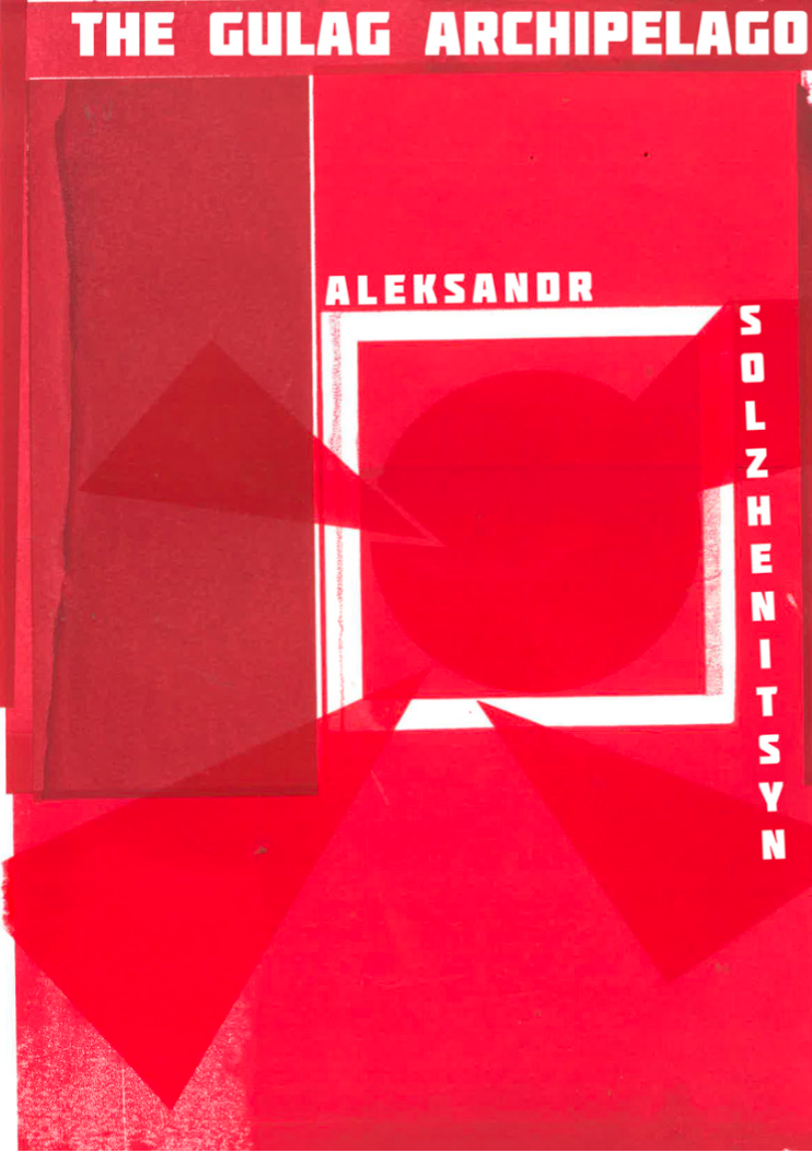
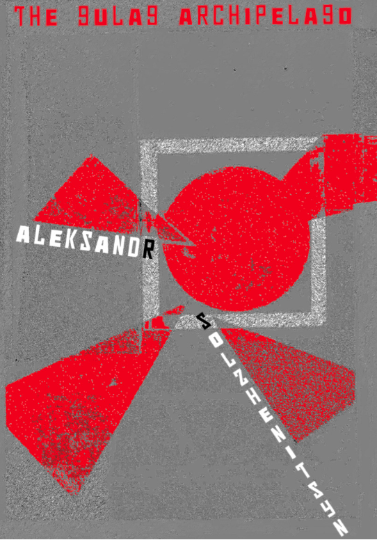
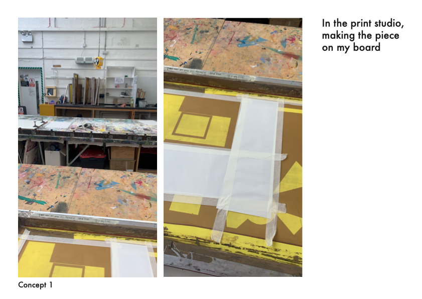
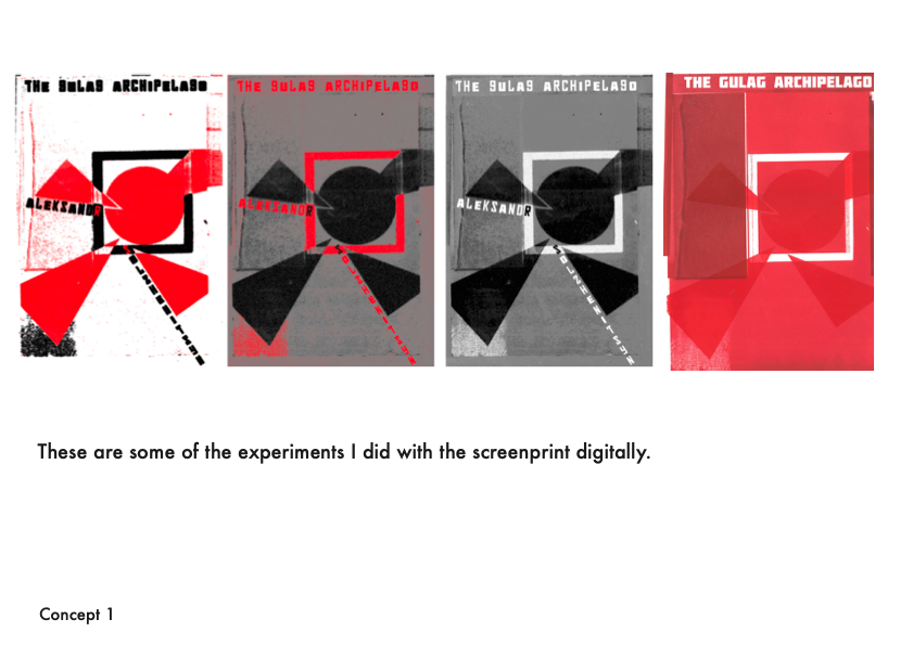
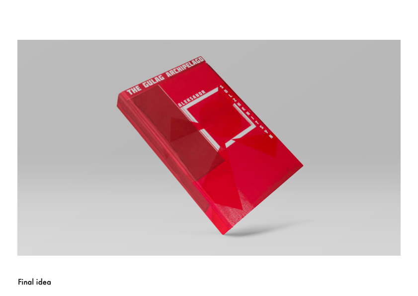
I sketched my layout ideas before creating this with screen printing and then edited digitally afterwards. I used tenets from suprematism to create a cover with symbolism and meaning:
Essentially the circle is the imprisoned citizens and the white square represents the gulag and the feeling of being trapped. The triangles are symbolising the Russian enforcement and feeling surrounded, nowhere to can go, this feeling is reinforced by the immense pressure of the triangle facing as- well as it represents being blocked off at every ‘angle’.
The triangle that has chipped away a part of the circle which shows that the Russian government own you and can do what ever they want with you, demonstrating their power; that they can mould and change you to what they want (oppression towards all ethnicities and cultures; in the gulag you're all the same, no identity, shaved head, uniform, numbered. Taken away your identity and culture.)
The triangle breaching the square means that the square wasn't really the gulag at all, in-fact it is just what living under communism rule feels like and the government (which is represented by the triangle crossing through the white square) has all the power to go or do whatever they want and was always in control. It shows a life of being trapped, but even though if you're not in a gulag you are technically free, but ‘freedom’ for citizens in Russia is not actually the same as in other, especially more developed countries.
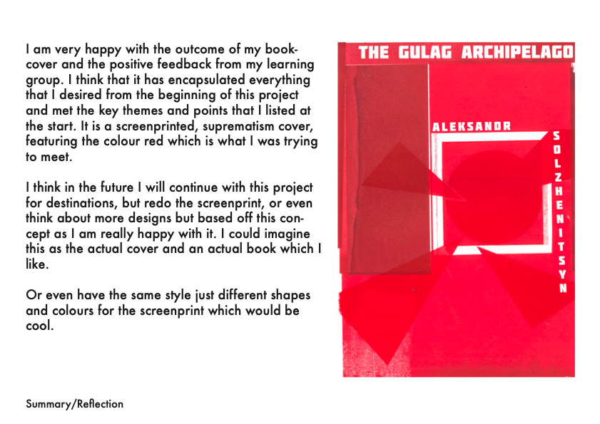
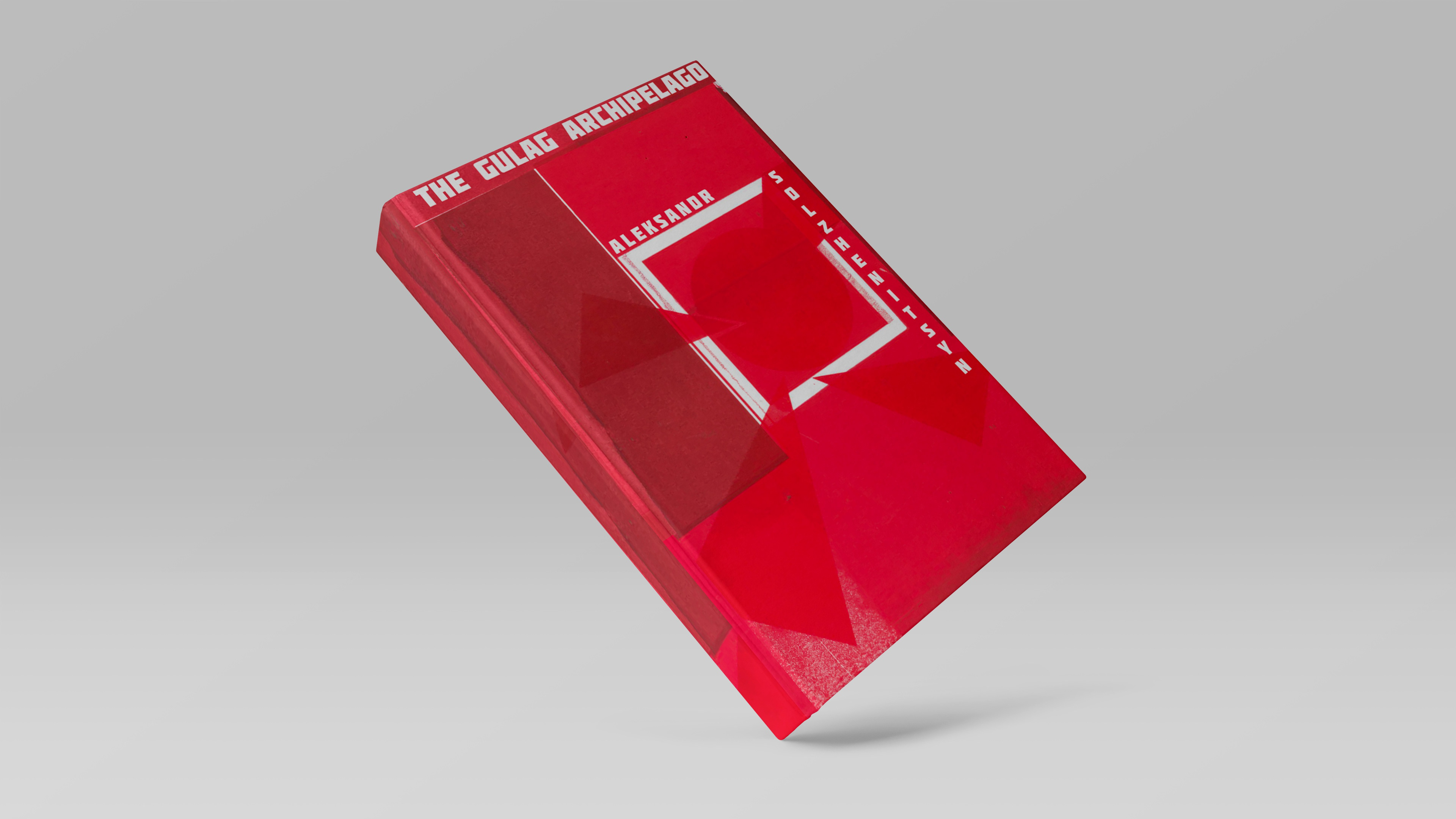
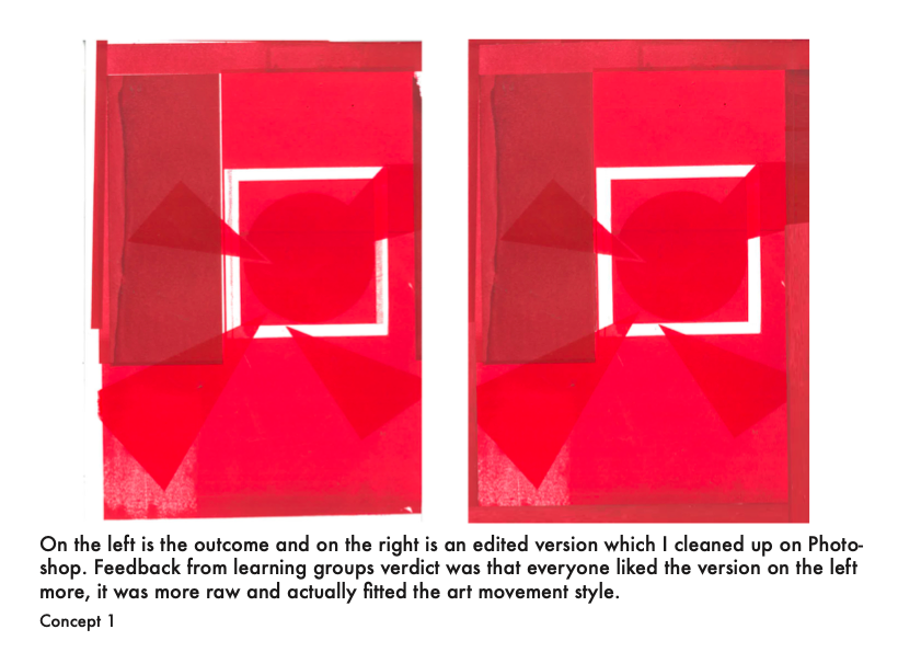
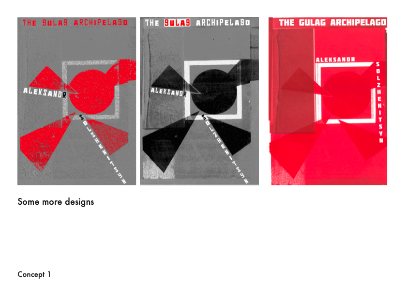
I played around with different styles and concepts but I chose the unedited, raw screen-printed cover with little digital editing for my final concept. This one had the best feedback and I agree with them too as it is my favourite, I think that it has encapsulated everything that I desired from the beginning of this project and met the key themes and points that I listed at the start. It is a screen-printed, suprematism cover, featuring the colour red which is what I was trying to meet.
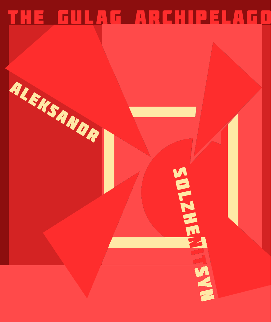
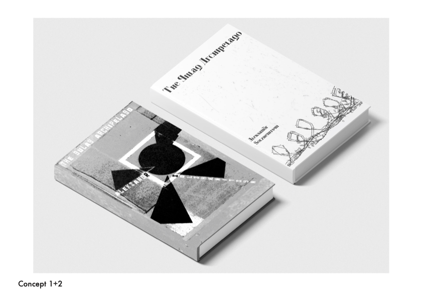
On the right are other concepts and images relevant to the project, from top to bottom: 1) Screen printing the cover in the studio, 2) Other concepts visualised, 3) The digital layout sketch before I screen printed, 4) The screen print cover in different style, 5) A cover that I didn't choose for my final concept


Journey and development below
Introduction
Aims
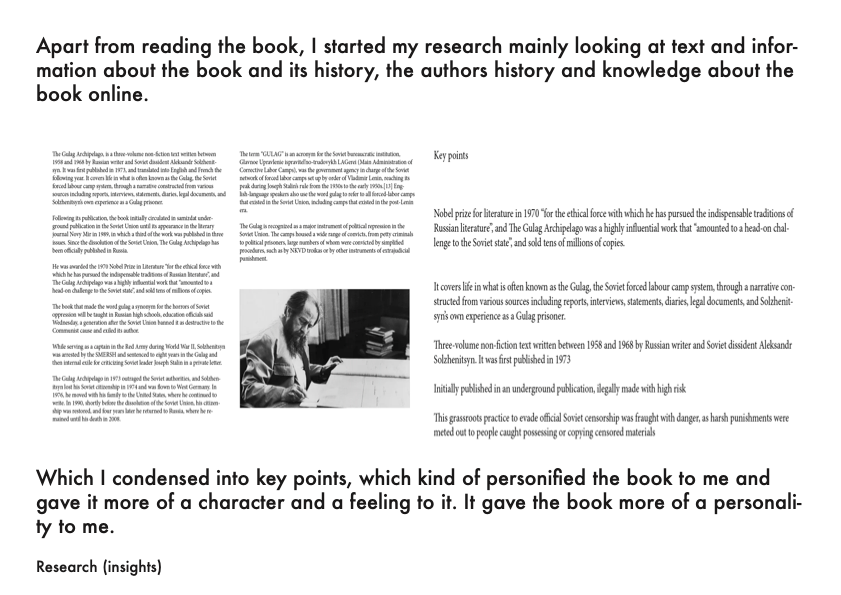
Research
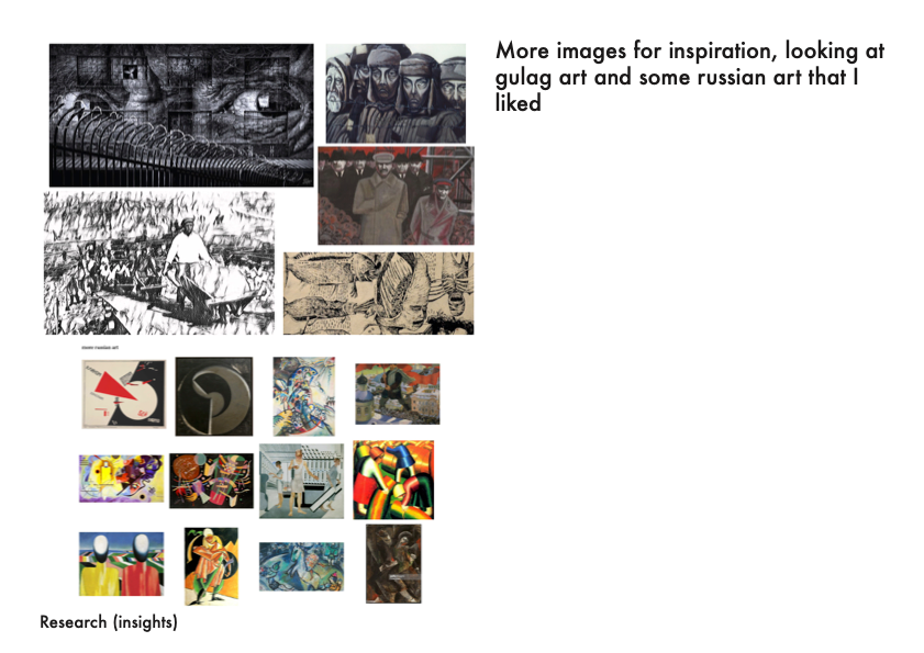
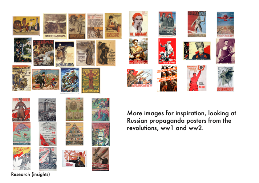
Research continued

Workshops


Next concept
Mock ups
Summary